PORTFOLIOHavet’s Bobler
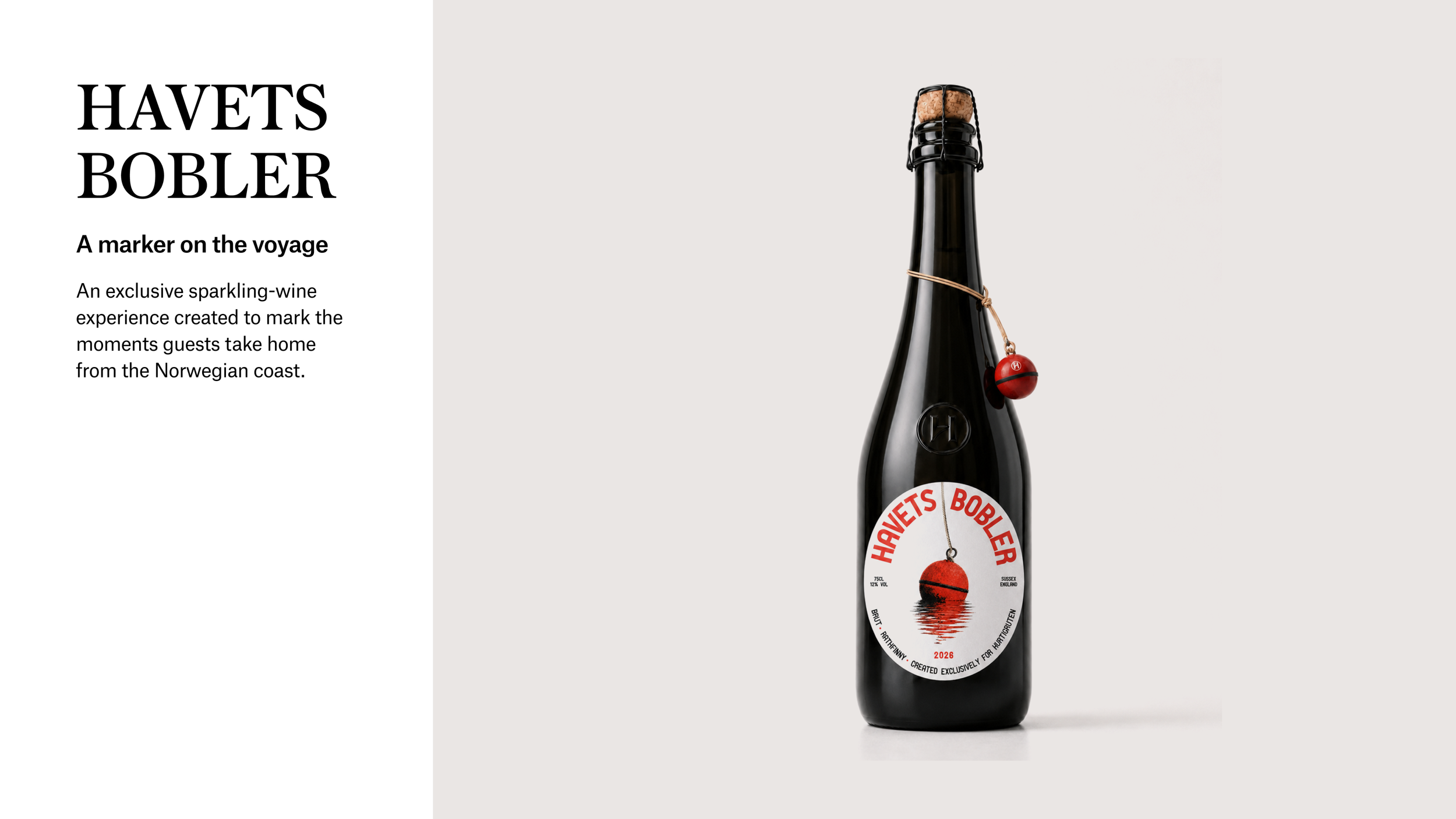
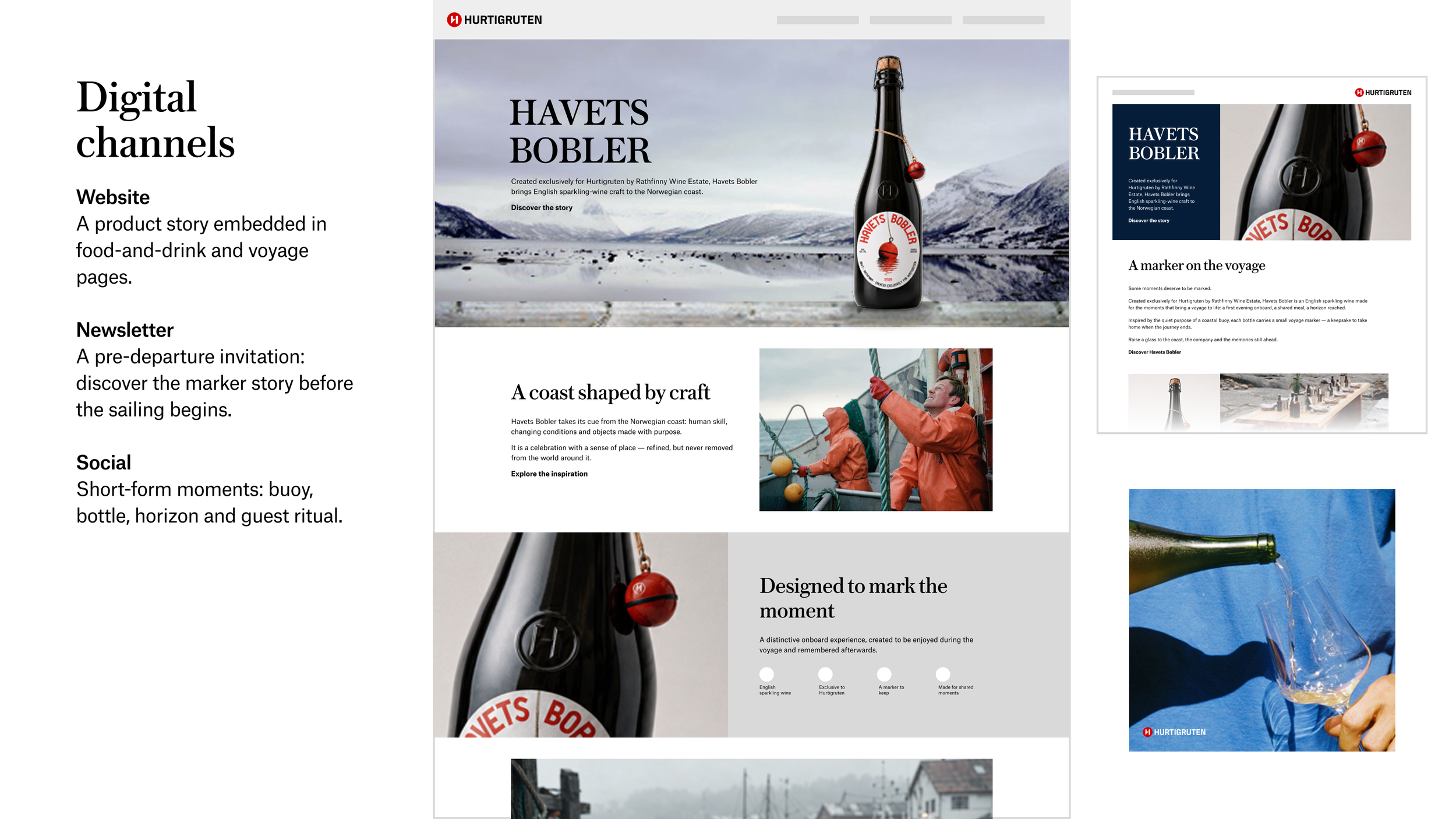
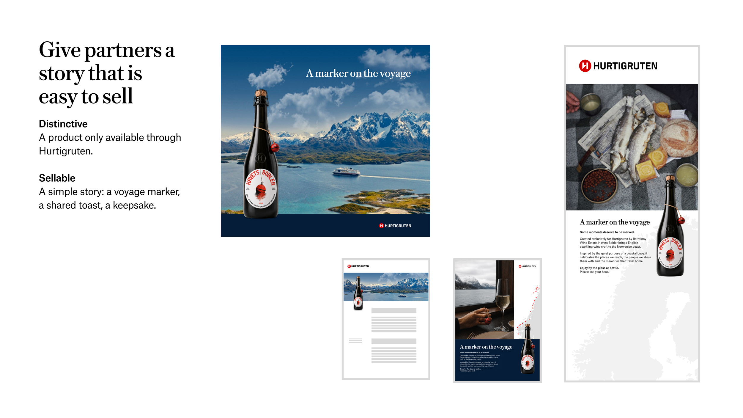
Hurtigruten and Rathfinny created Havets Bobler, an exclusive sparkling wine served onboard Hurtigruten ships. As part of a recruitment exercise, I was asked to explore a concept identity that could connect the product more closely to the Norwegian coast and extend across product, onboard and marketing touchpoints.
The challenge
The product needed to feel premium without falling into familiar luxury-wine conventions. It also needed to bring together two different worlds: the raw, working character of the Norwegian coast and a refined onboard hospitality experience.
I explored the visual and emotional tensions around the product: working harbour and premium hospitality, navigation and discovery, traditional craft and contemporary expression. This led to a simple question: what is the most compelling reason for this bottle to exist on this particular voyage?
The idea
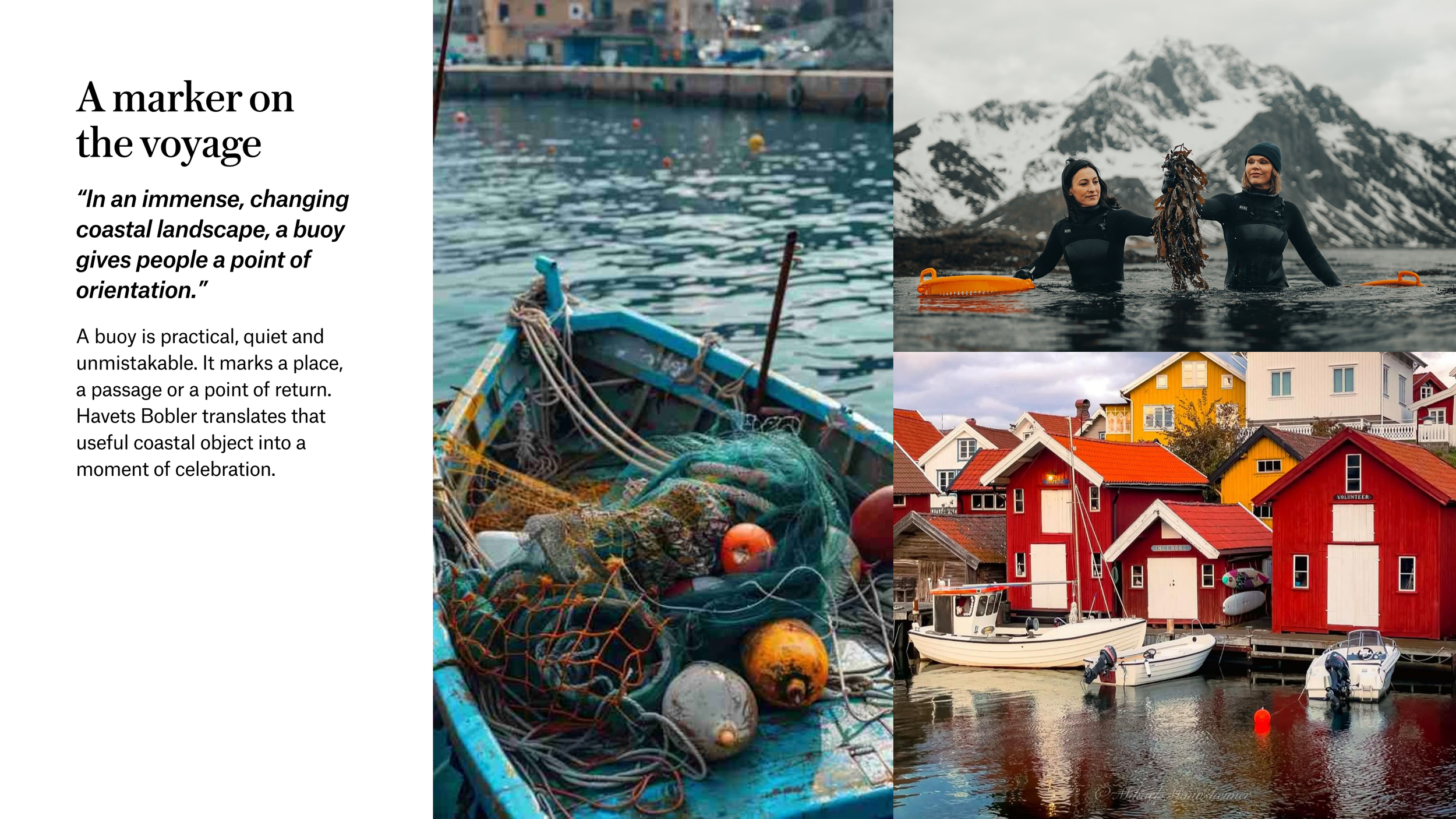
The concept, A marker on the voyage, takes its cue from the humble coastal buoy.
A buoy is practical, recognisable and quietly reassuring. It marks a position, a passage or a point of return within a changing landscape. I used that idea to frame Havets Bobler as more than a bottle: a marker of a shared experience and a memory guests could take home.
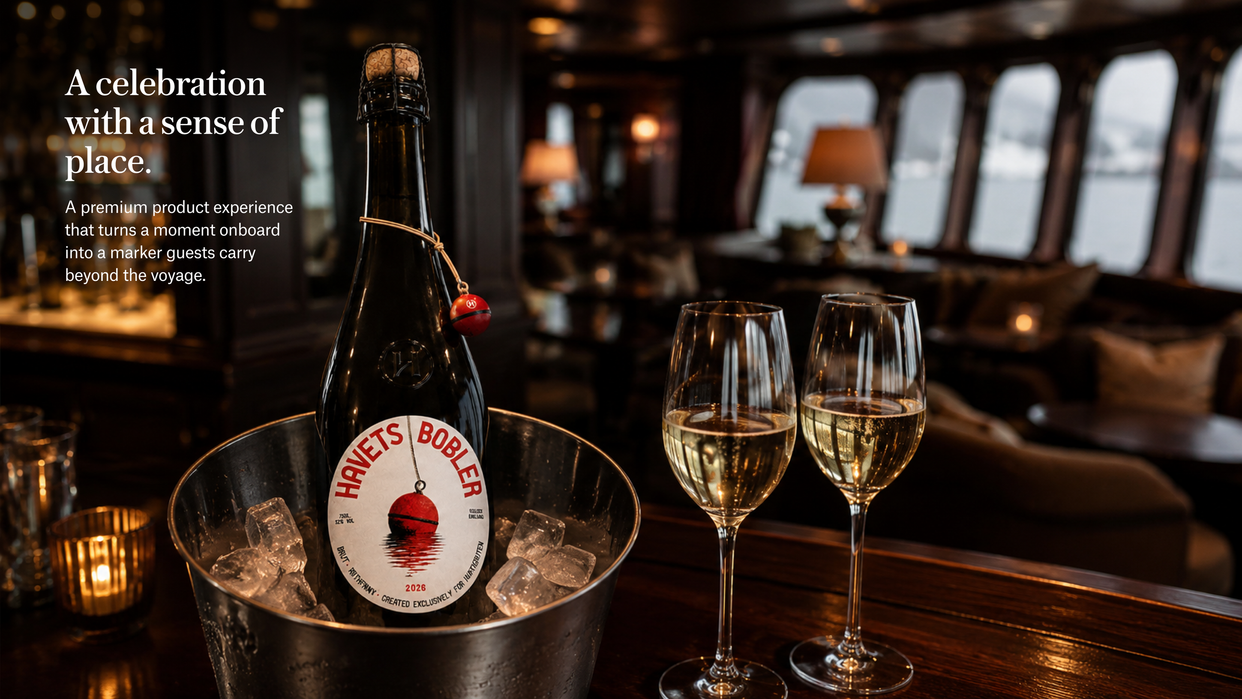
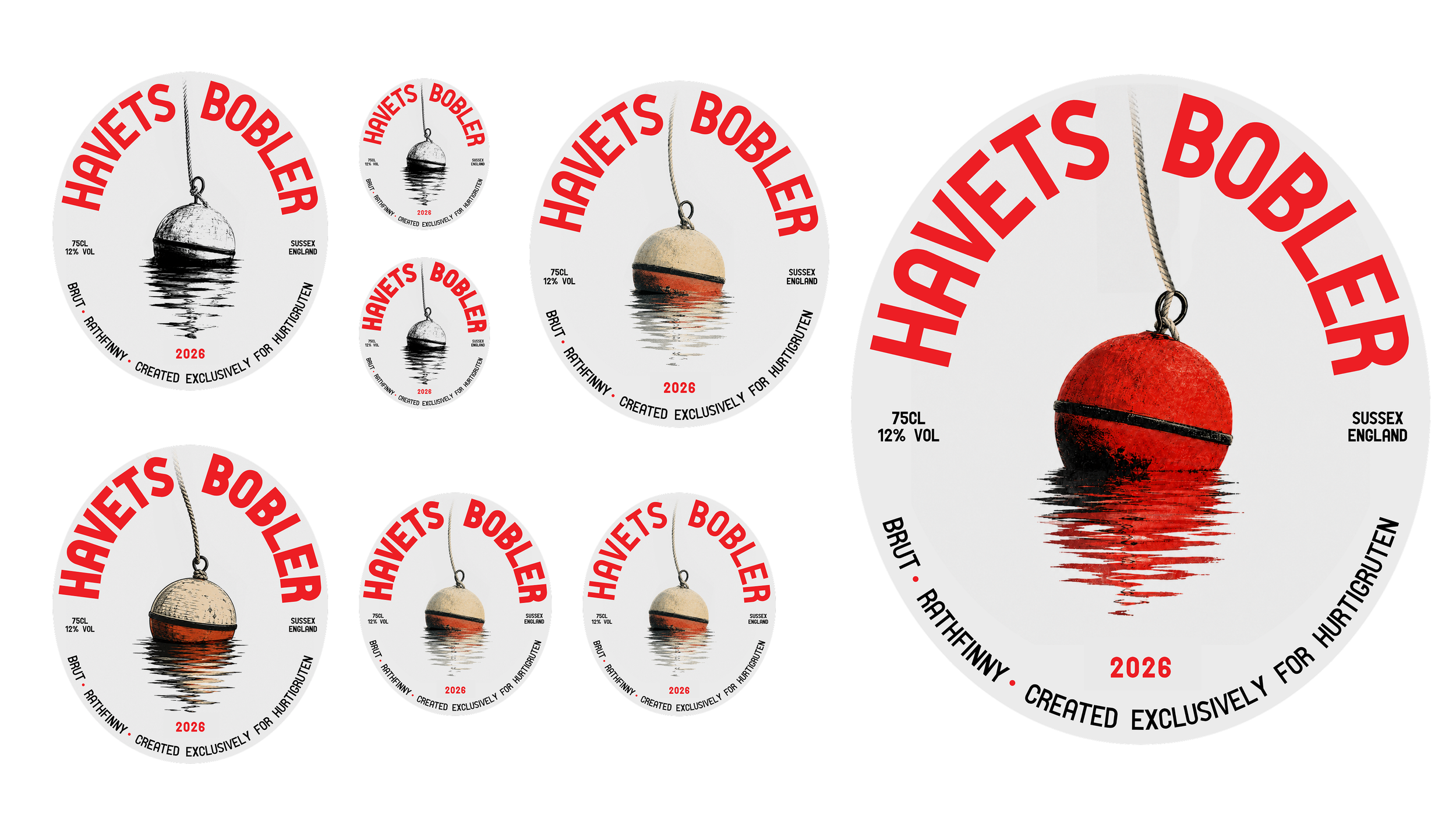
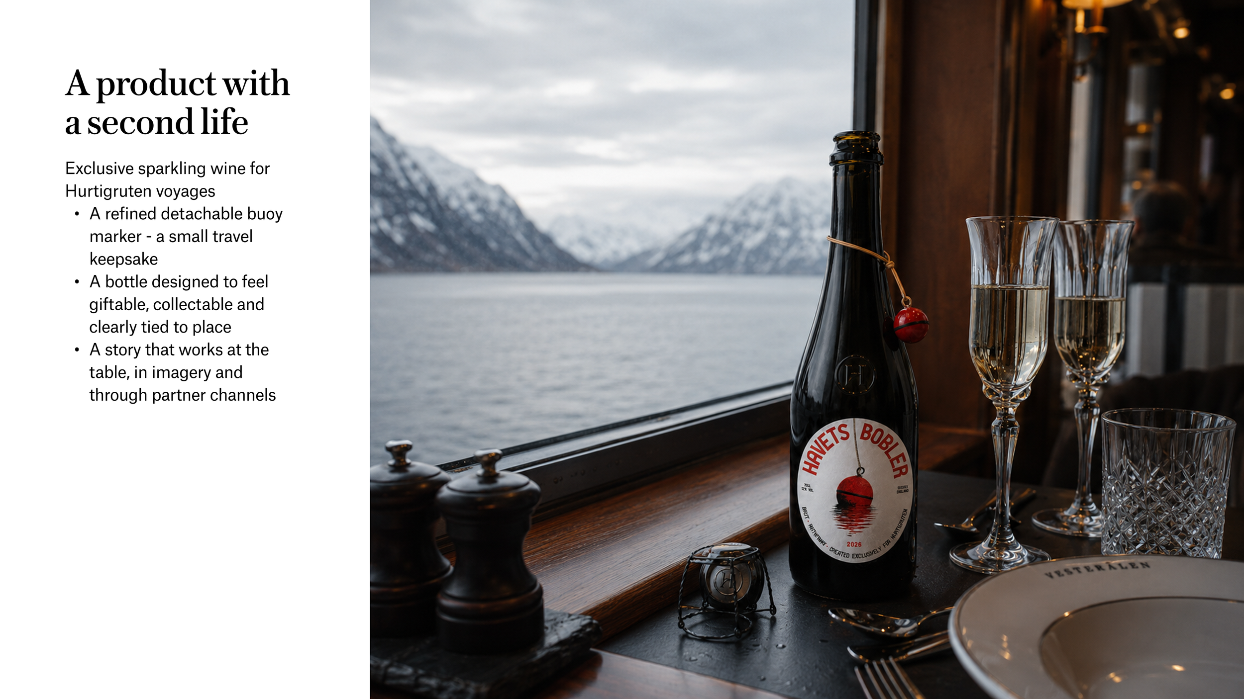
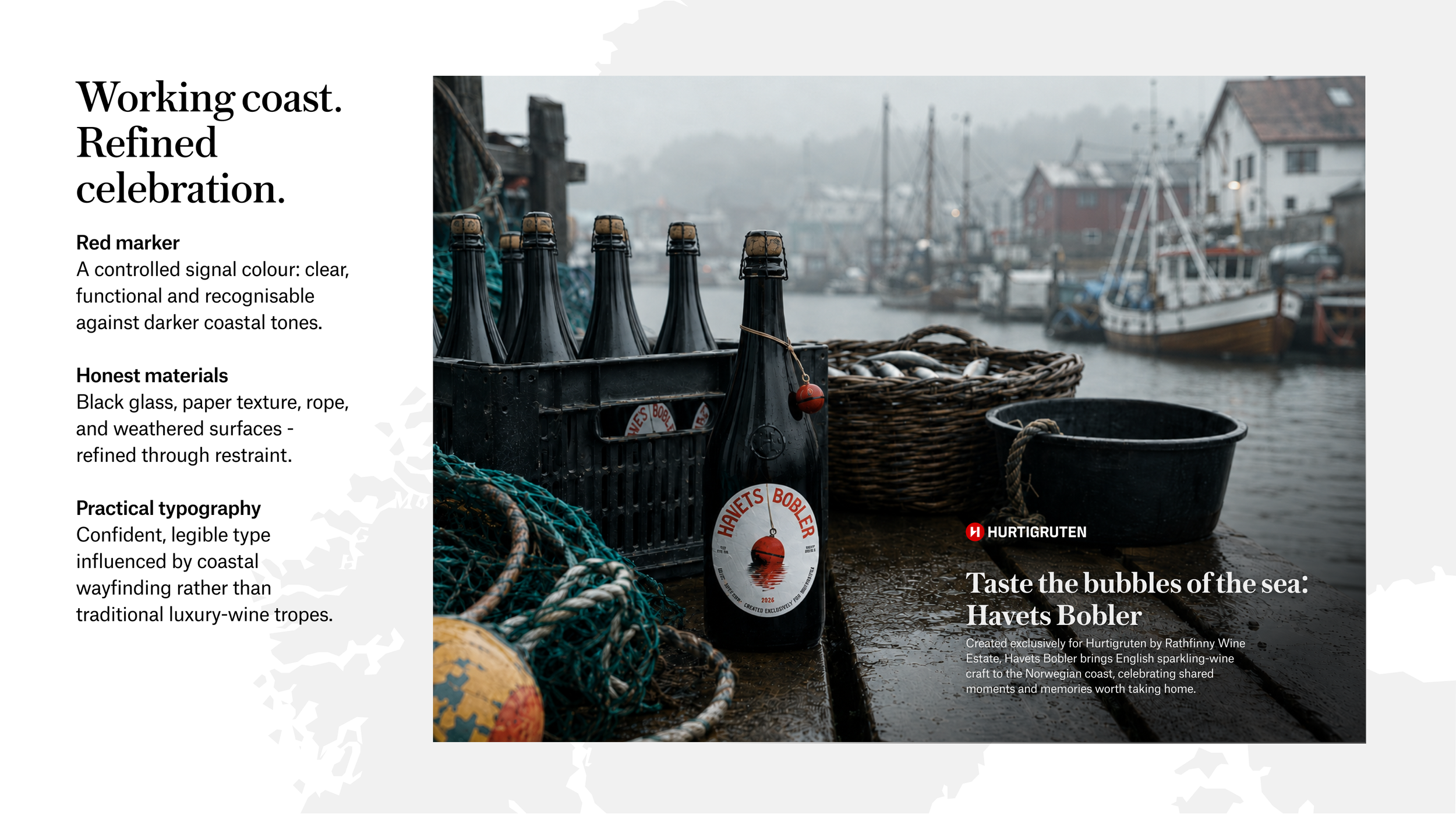
The circular label combines a buoy illustration with confident red typography. A detachable buoy marker extends the idea beyond the label, giving the bottle a small second life as a travel keepsake.
Also in this portfolio
The 2026 work – Converge World Tour (London and Paris) and AI in creative practice.
CreditsDesigners
David Lewis
Organisation
Hurtigruten