PORTFOLIO CASE STUDYBrand & Creative Systems: Tanium
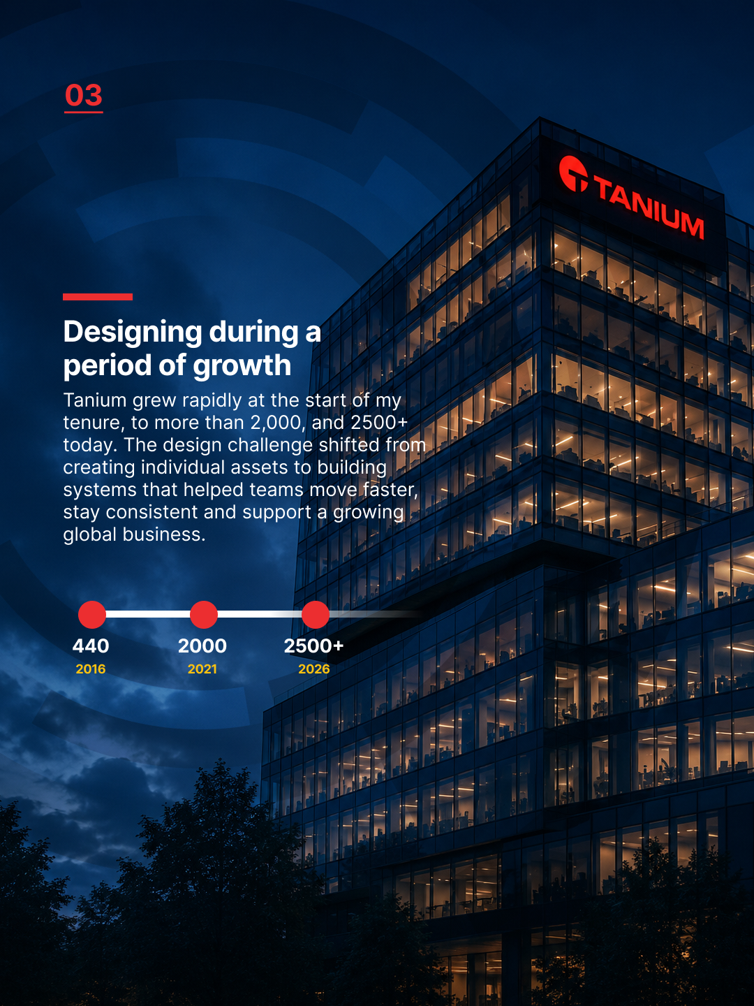
From 2021 to 2025, Tanium experienced rapid growth, and its brand evolved each year. This case study examines the systems, assets, and deliverables that shaped how Tanium’s brand appears across channels.
WorkflowAdobe Creative Suite, Figma, AI-assisted creative tools, Notion and Microsoft 365 were used across concept development, production, documentation, approvals and scalable brand operations.
Building a scalable brand system for Tanium
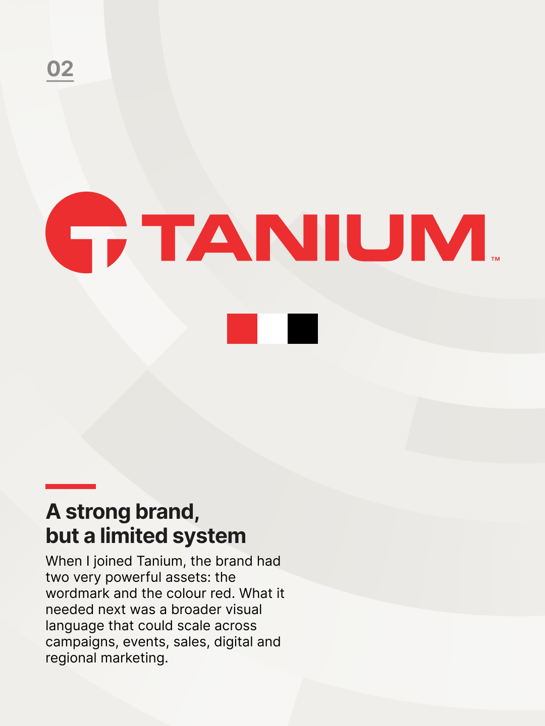
When I joined Tanium, the company already had a bold and recognisable identity. The wordmark was strong, the red was distinctive, and the brand promise around certainty gave the company a clear position in the enterprise technology space.
But the wider visual system was limited. As the company grew, the brand needed to support more campaigns, more events, more regional marketing, more sales materials and more internal stakeholders. The challenge was not to replace what made Tanium recognisable, but to mature it into a flexible system that could scale.
Creating a system from the product story
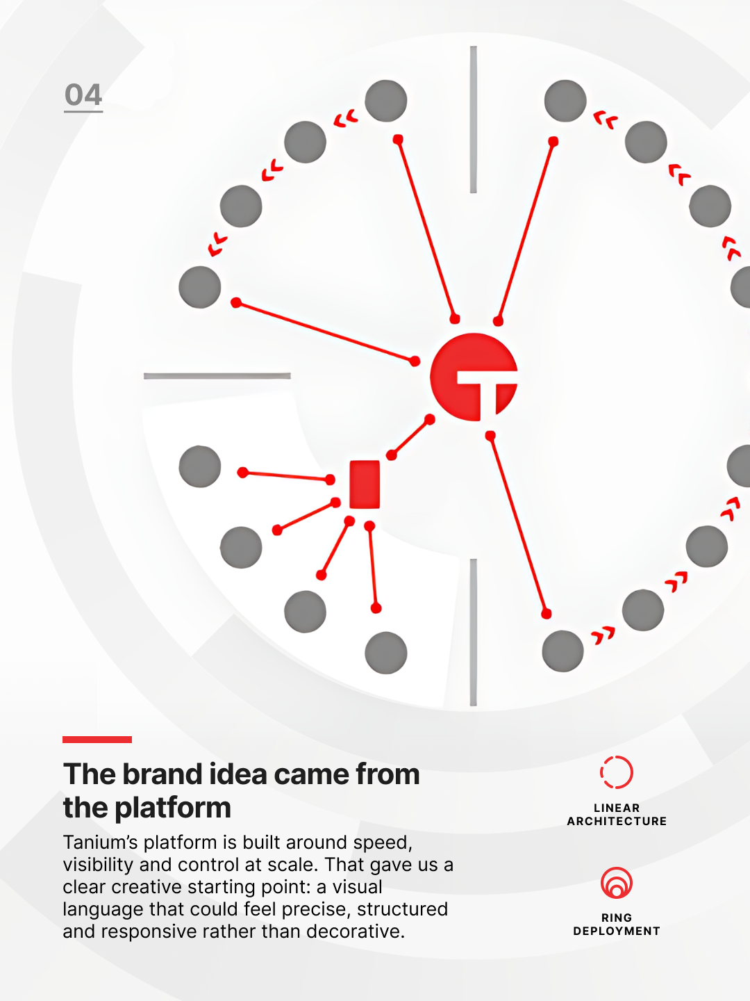
Tanium’s platform is built around speed, visibility and control at scale. That gave the brand work a useful foundation. The visual language could connect to the product itself, rather than becoming a decorative layer applied afterwards.
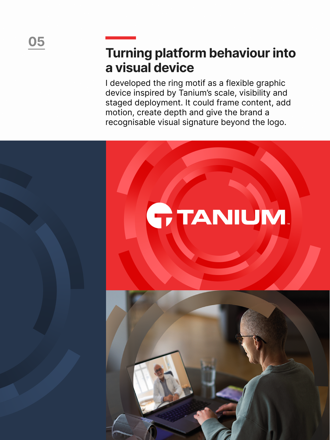
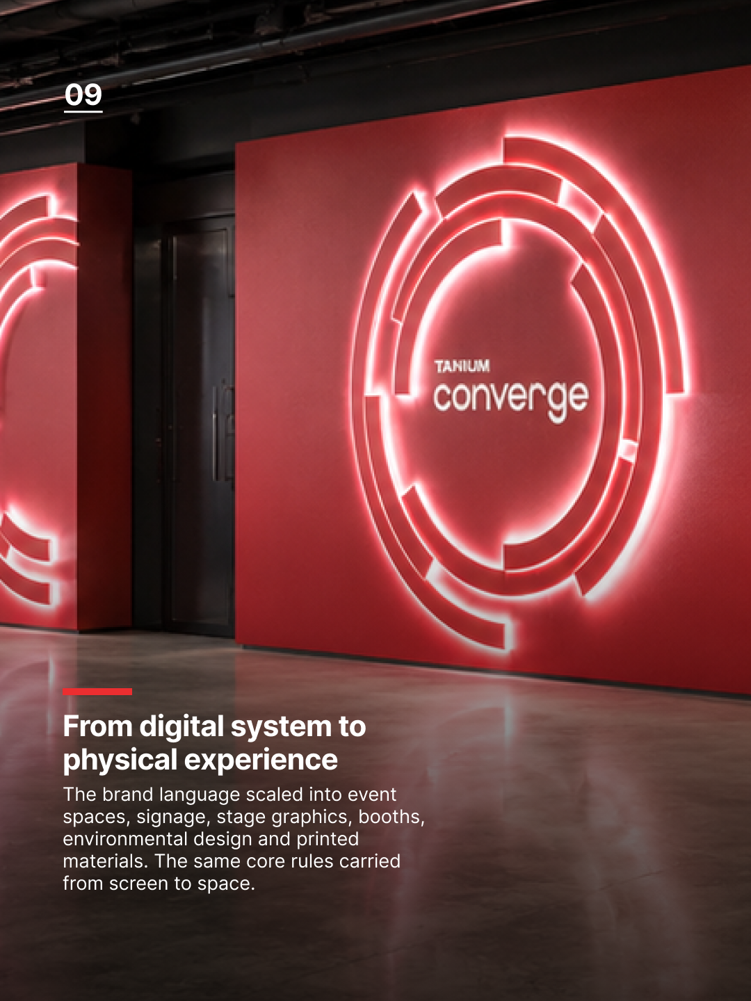
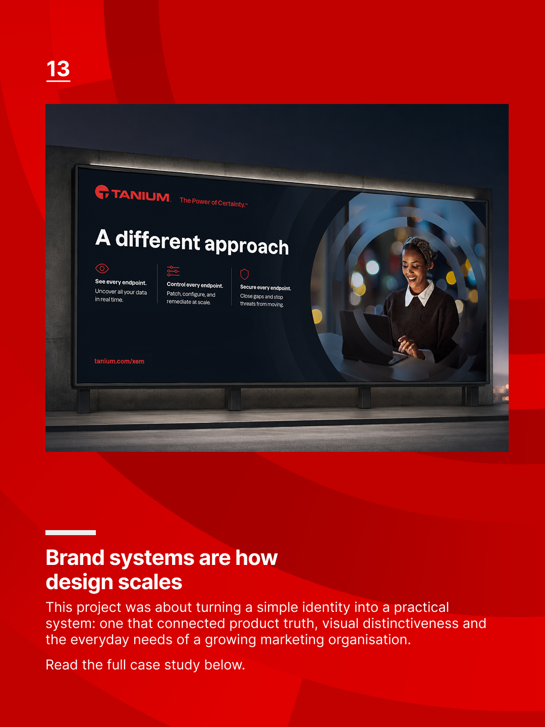
The ring motif became a central part of that evolution. Inspired by ideas of visibility, response and staged deployment, it gave the brand a flexible graphic device that could work across many different formats. It could frame content, sit behind photography, create depth through overlays, support motion and become a recognisable brand signature beyond the logo.
Expanding the visual language
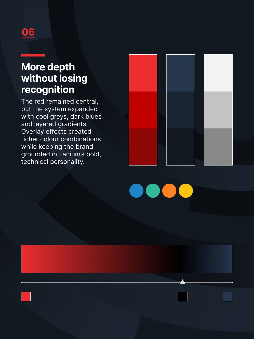
Red remained the anchor of the identity, but the system needed more tonal range. We expanded the palette with cool greys, dark blues and deeper red gradients, giving the brand more flexibility across campaigns, digital environments and event spaces.
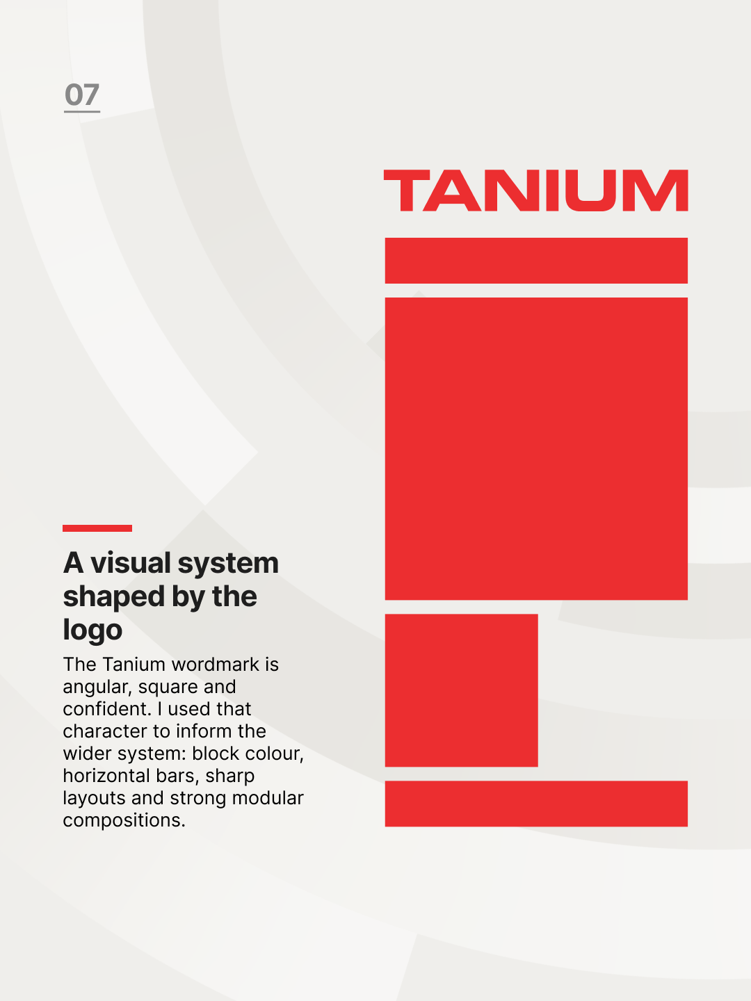
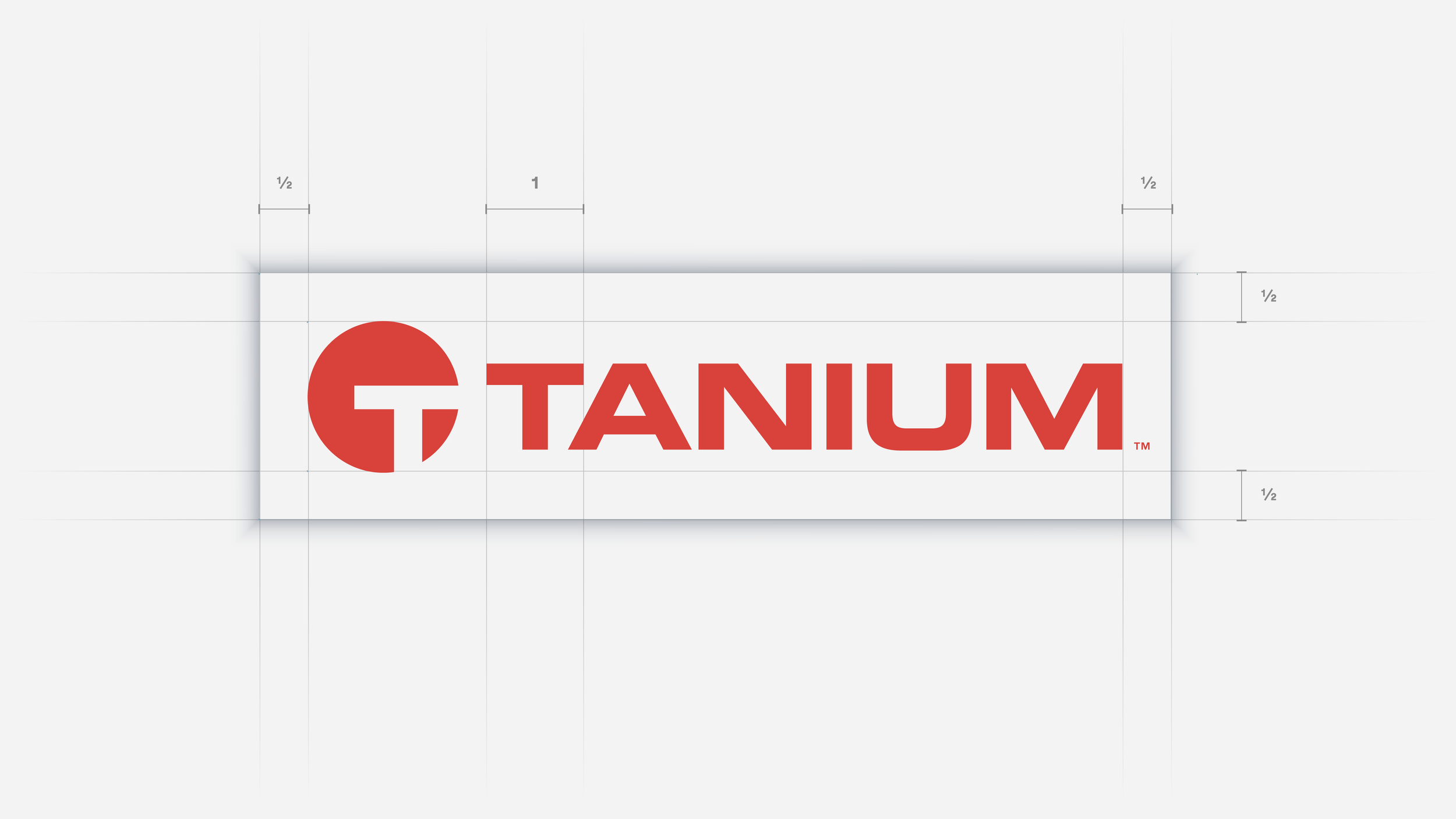
The Tanium wordmark also influenced the wider system. Its angular, square and confident character translated into block colour, horizontal bars, modular layouts and strong typographic structures. This helped the brand feel direct, technical and consistent without becoming rigid.
Applying the system
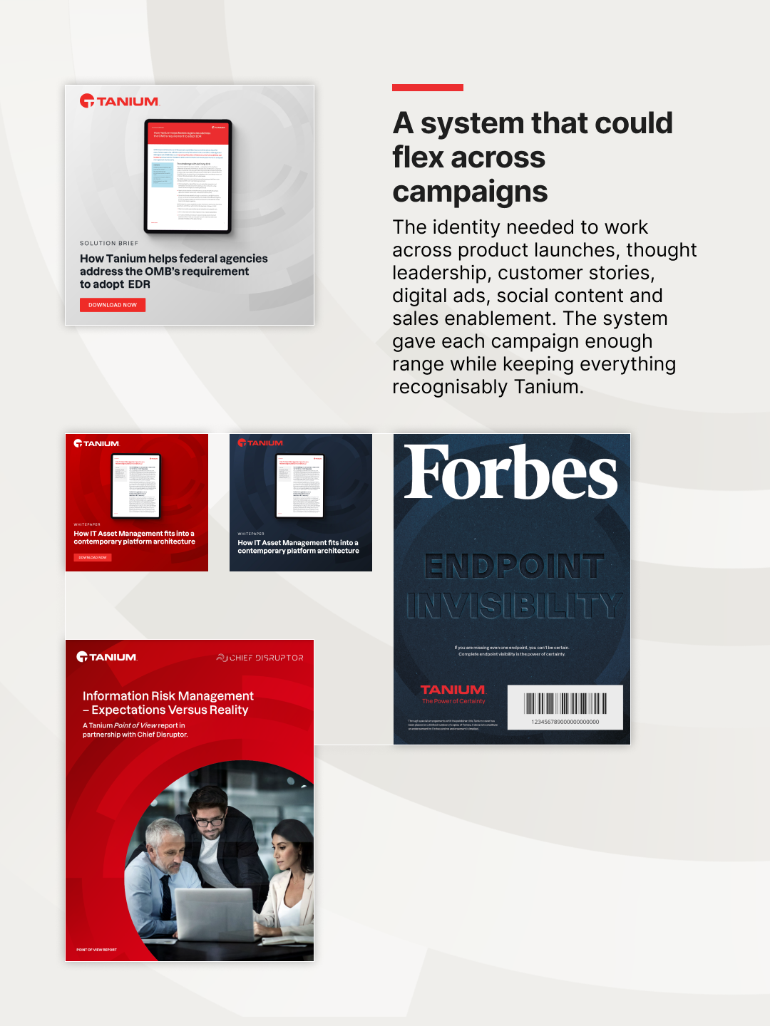
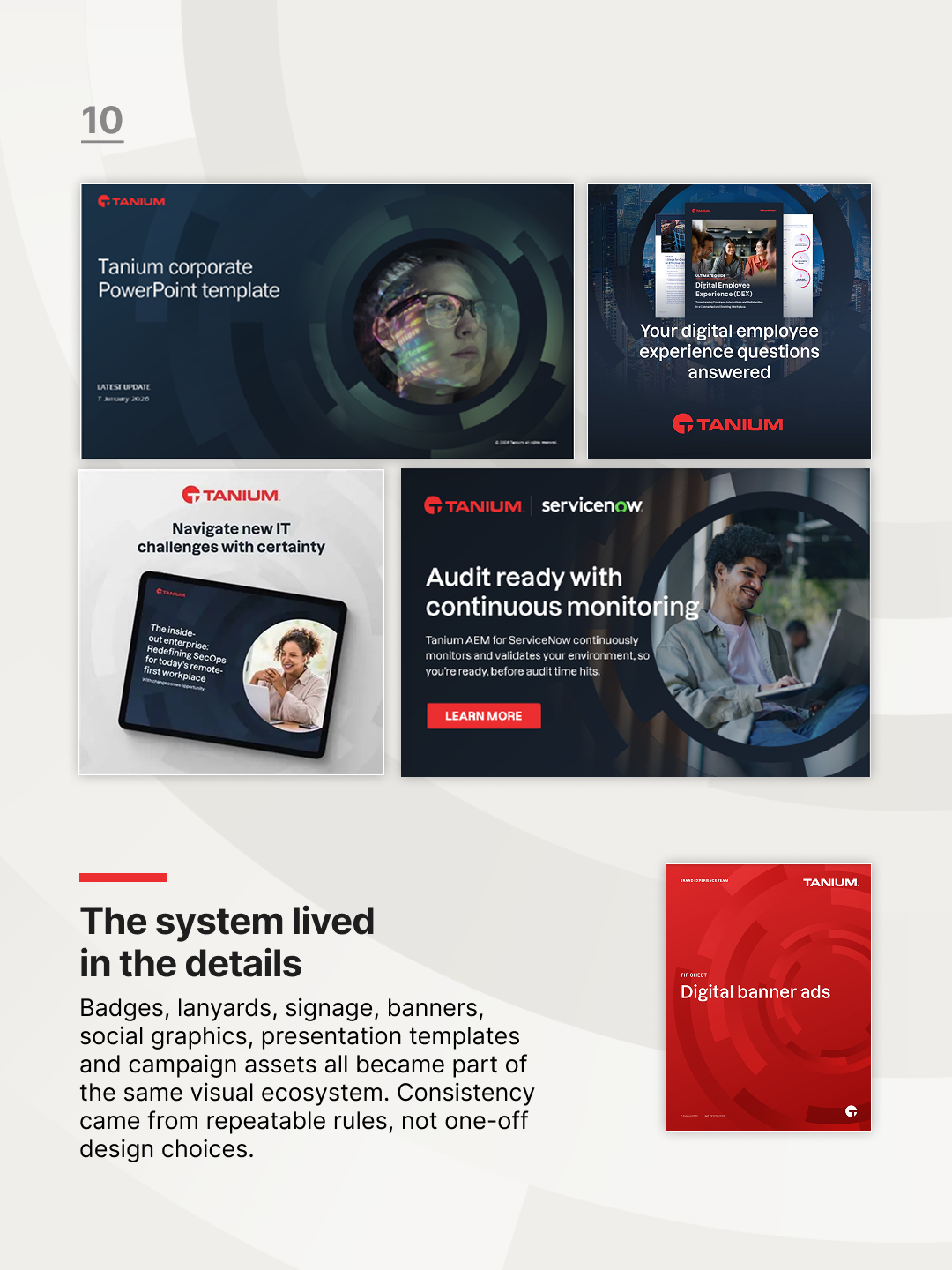
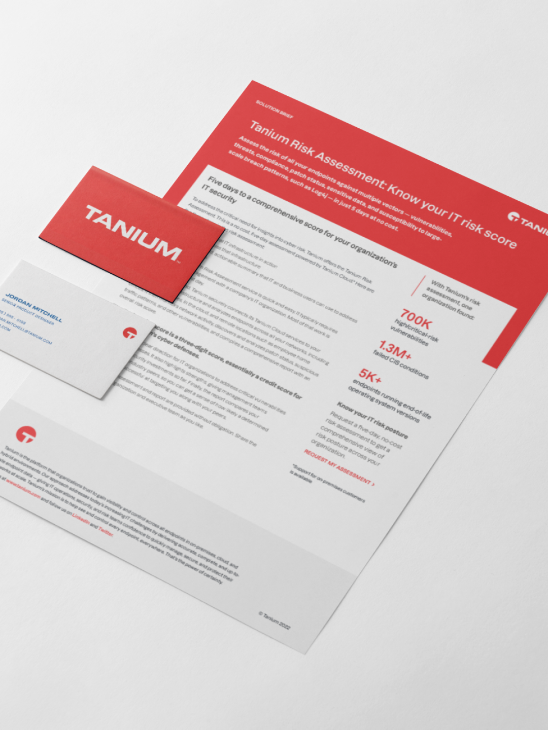
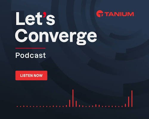
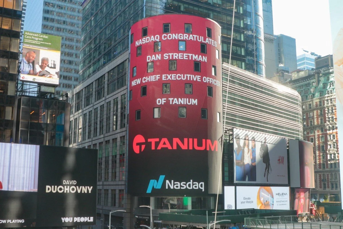
The evolved identity was used across campaign assets, digital advertising, social graphics, sales materials, presentation templates, event environments, signage, lanyards, badges and large-format applications.
The strength of the system was its ability to flex. It could support bold brand moments, detailed product stories, executive presentations, event experiences and smaller everyday assets while still feeling recognisably Tanium.
Scaling through design operations
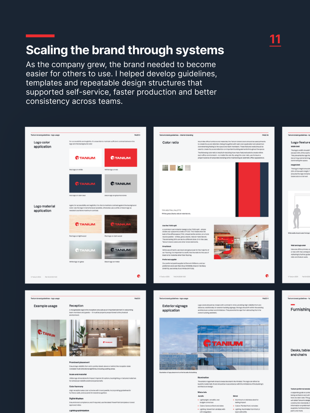
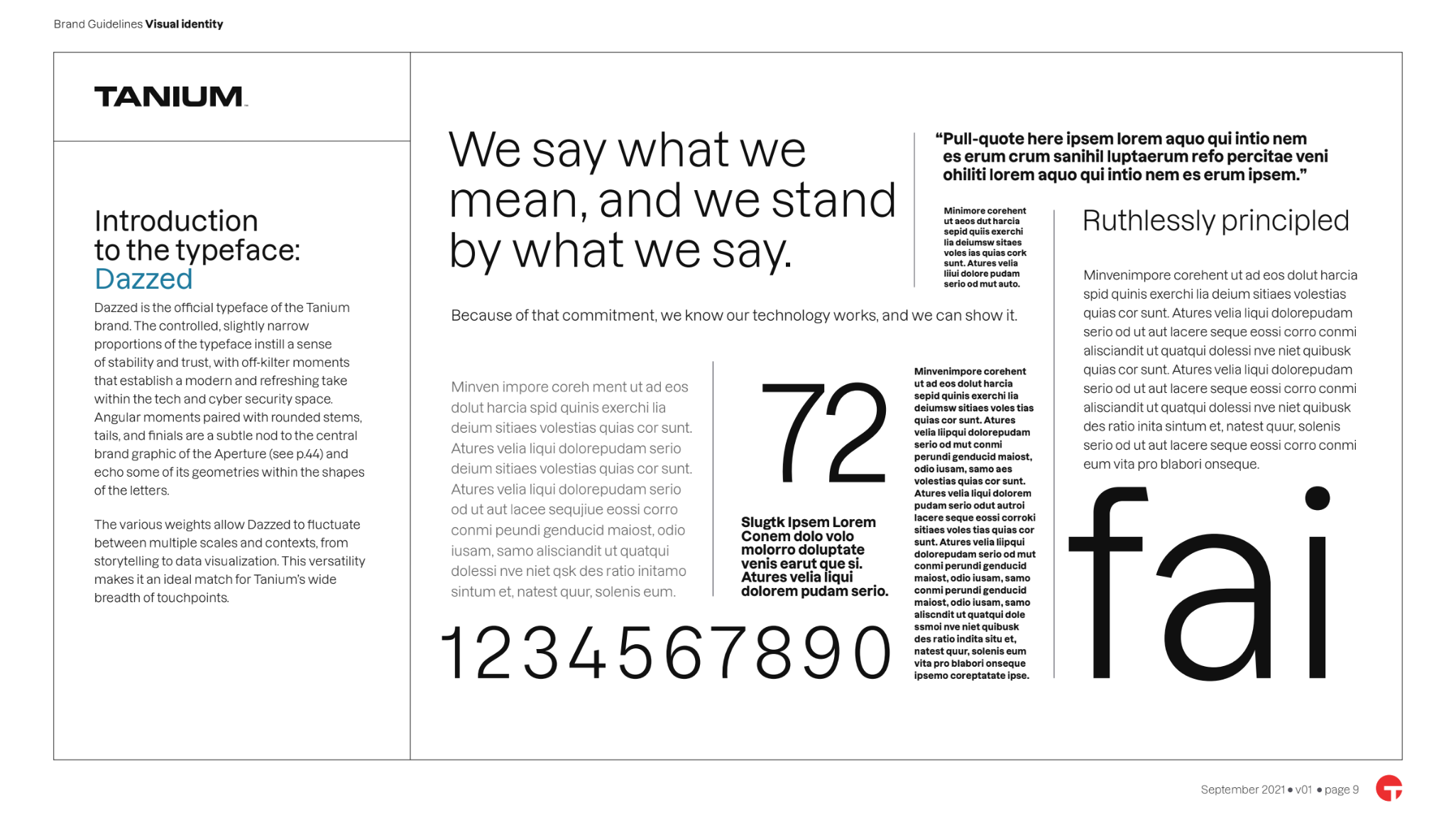
As the business grew, the brand needed to become easier for others to use. Guidelines, templates and repeatable layout structures helped teams create work more consistently and reduced the need to reinvent common assets from scratch.
This was a key part of the project. The brand system was not just about visual consistency. It was about helping teams move faster, make better decisions and create work that felt connected across different channels and regions.
Outcome
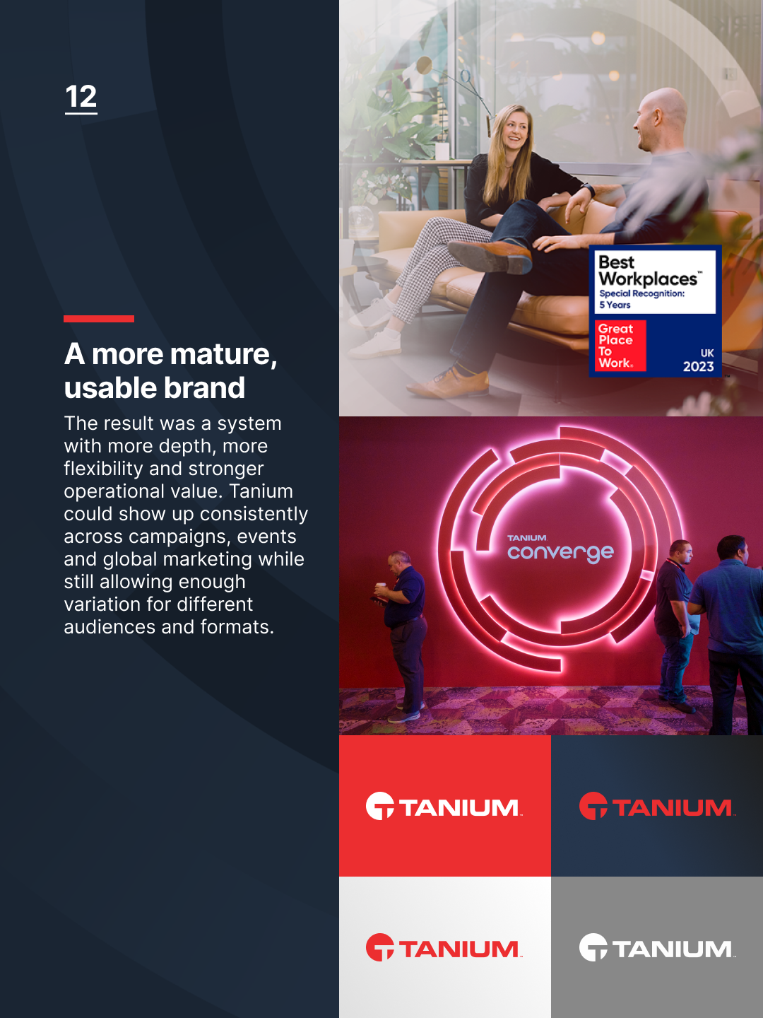
The result was a more mature and usable brand system. Tanium retained the strength of its original identity while gaining more depth, flexibility and operational value.
For me, this project shows the value of brand systems in a growing technology company. Good systems do more than make things look consistent. They connect strategy, craft and execution, helping a brand show up clearly across every touchpoint.
Also in this portfolio
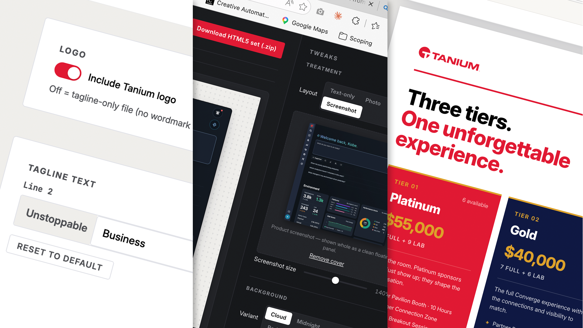
The 2026 work – Converge World Tour (London and Paris) and AI in creative practice.
CreditsCreative Director
Sarah Li
Designers
David Lewis, Blake Fife, Chris Harris, Jenna Kim
Organisation
Tanium